
I once spent forty-five minutes trying to convince a client that a textured concrete wall wasn’t a “distraction,” but a feature, only to realize I’d positioned them so close to the surface that their shadow looked like a dark, muddy bruise. Most tutorials will tell you that learning how to shoot a portrait against a wall is about finding the perfect aesthetic backdrop or buying a $500 seamless paper roll, but they’re lying to you. In reality, the wall is usually a fight against unpredictable shadows, harsh reflections, and the way a subject’s shoulders tend to hunch when they feel pinned against a flat surface.
I’m not here to talk about color palettes or which expensive paper looks best under studio strobes. Instead, I want to talk about the actual physics of the room: how many inches of separation you need to avoid that dreaded shadow, how to handle a wall that’s bouncing light back into your subject’s eyes, and why you should never let them lean back. This is the practical, unpolished side of the work—the stuff that actually matters when you’re standing in a cramped studio with a client who is already losing their patience.
The Wall Why the Background Is Usually the Real Problem
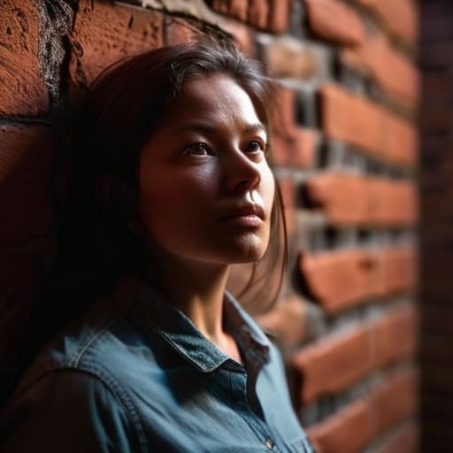
Most people walk into a shoot thinking about their lens choice, but they should be looking at the surface behind the subject. A wall isn’t just a backdrop; it’s an active participant in the frame. If it’s a flat, white drywall in a corporate office, it’s going to fight you by reflecting light in ways that flatten your subject’s features. If it’s a textured brick wall, it might try to steal the attention away from the person you’re actually there to capture. The real struggle isn’t the gear; it’s managing how that surface interacts with your light.
I’ve spent too many sessions watching a perfectly good portrait get ruined because the subject looks like they’ve been pasted onto a flat plane. You can’t just lean someone against a surface and call it a day. You need to master background separation techniques to create a sense of space. This usually means pulling the subject a good three to five feet away from the masonry or plaster. If you stay too close, you lose the ability to use depth of field for wall portraits, and suddenly, every crack in the paint is as sharp as the subject’s eyes.
Mastering How to Shoot a Portrait Against a Wall

If you’re stuck with a wall, stop trying to ignore it and start deciding what role it plays. My first instinct is usually to create distance. I’ll pull the subject at least two meters away from the surface to exploit depth of field for wall portraits, turning a flat, boring plaster expanse into a soft, creamy wash of color. If you’re working in a tight studio with no room to move, you have to pivot. Instead of fighting the flatness, lean into it.
This is where you start playing with using shadows for depth. If the light is coming from a harsh side angle, let the texture of the wall—the bumps, the paint strokes, the imperfections—become part of the mood. I often find that a single light source, positioned about 45 degrees to the side, creates just enough fall-off to stop the subject from looking like they’ve been pasted onto a backdrop. It’s about finding that sweet spot where the wall provides structure without swallowing the person standing in front of it.
Using Shadows for Depth When the Room Feels Flat
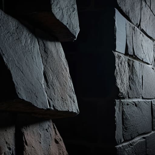
When you’re working against a wall, the biggest risk isn’t a bad texture; it’s the “pancake effect.” That’s when your subject looks like they’ve been physically glued to the surface, losing all dimension. To fix this, stop trying to light everything evenly. If you treat the wall like a giant reflector, you’ve already lost. Instead, try using shadows for depth by pulling your key light further to the side. Even a single light source, if positioned at a steep angle, will cast a soft shadow behind the subject. That shadow is your best friend; it creates a physical buffer between the person and the masonry, giving the eye a way to perceive space where there seemingly isn’t any.
If you’re stuck with a flat, white wall in a cramped room, don’t fight the lack of character—lean into it. I often use a simple flag or even a piece of black foam core to create intentional fall-off. By controlling where the light hits and where it dies, you can use shadow as a compositional tool rather than an accident. It’s about creating a gradient. If the light tapers off before it hits the wall, you get that natural separation that makes a portrait feel three-dimensional rather than two-dimensional.
Natural Light Portrait Photography Fighting the Harsh Afternoon Sun
If you’ve booked a shoot for 3:00 PM because that’s when the client is free, you’ve probably just signed up for a battle with the sun. Afternoon light isn’t a “mood”; it’s a blunt instrument. It hits the side of the face with enough intensity to turn a cheekbone into a white crater and the shadows into black voids. When you’re doing natural light portrait photography against a wall, that harshness is amplified because the wall itself becomes a giant reflector, bouncing that nasty, high-contrast glare right back into your subject’s eyes.
Don’t try to fight it by cranking your shutter speed; you’ll just end up with a technical success that looks emotionally dead. Instead, look for the “dead zones.” Move your subject into the shadow of a building or under a heavy overhang, even if it means moving ten feet away from the wall you originally planned to use. If you can’t move, use a large white foam board—not a fancy reflector, just a piece of foam—to catch that spill and soften the transition. It’s about managing the bounce, not just chasing the light.
Portrait Photography Lighting Setups That Actually Save the Day
When you’re backed into a corner—literally—you can’t rely on a massive, multi-light spread. Most of the time, you’re working with a single light and a prayer. If the wall is looking too flat or, worse, too distracting, I usually reach for a single medium softbox placed about 45 degrees off-axis. The trick isn’t just hitting the subject; it’s about intentional distance. I’ll pull my subject two or three feet away from the surface to create some breathing room. This is where you start using background separation techniques to make sure they don’t look like they’ve been glued to the masonry.
If you’re stuck with just a window, don’t panic. I’ve saved more shoots with a single pane of glass than with a $5,000 strobe kit. You just have to manage the fall-off. I like to use a black foam board on the shadow side to keep the light from bouncing off a white wall and washing out the contrast. By controlling the spill, you can use shadows to carve out the jawline even when the environment is working against you.
Depth of Field for Wall Portraits and Background Separation Techniques
If you’re standing your subject right up against the masonry, you’re basically asking for a flat, lifeless image. Even with the best lighting, that wall will feel like it’s leaning on them. This is where most people panic and start reaching for more gear, but the real fix is understanding depth of field for wall portraits. I usually tell my assistants to pull the subject at least three to five feet away from the surface. It feels like wasted space in a cramped studio, but that gap is your best friend. It allows the light to fall off naturally, turning a distracting brick pattern into a soft, creamy wash of color.
When you can’t move the subject—maybe because the client is terrified of the open room—you have to rely on background separation techniques that play with optics rather than distance. I’ll widen the aperture to f/2.8 or f/1.8, but don’t get cocky; if you’re shooting a group, that’s a recipe for disaster. Instead, I focus on the fall-off. By combining a shallow depth of field with a bit of intentional shadow, you create a sense of three-dimensional space that makes the subject pop without needing a massive studio setup.
Five things I wish I’d known before my first studio session
- Stop pinning people directly against the plaster. Unless you’re going for a very specific, gritty editorial look, pull them at least two meters away from the wall. If they’re touching the surface, every awkward slouch or uneven shoulder is going to be magnified by the shadow they cast right behind them. Space creates the depth that a lens alone can’t always manufacture.
- Watch the “hot spots” on the texture. If you’re working with a brick wall or something with heavy stucco, your light is going to hit those ridges and create a mess of micro-shadows. I usually move my key light further to the side—maybe a 45-degree angle or even more—to skim the surface rather than hitting it head-on. It turns a distracting texture into a subtle, moody pattern.
- Mind the color spill. If you’re shooting against a bright red or a saturated blue wall, that color is going to bounce right back onto your subject’s skin, making them look sickly or bruised. If the wall is a nightmare, increase your distance from it or use a flag to keep the light from hitting the wall in the first place. You can’t easily fix “magenta skin” in post without making everything look fake.
- Use the wall as a shape-maker, not just a backdrop. If the room is cramped and the wall is ugly, don’t fight it—embrace the shadow. Position your subject so the wall falls into deep shadow, leaving only the texture of the subject’s silhouette or a sliver of the wall’s edge visible. It’s much easier to work with a dark void than a cluttered, beige office wall.
- Check the “hand-to-wall” contact. I always ask my subjects what they do with their hands when they’re nervous, and if they decide to lean against the wall, they usually end up looking like they’re trying to hide. If they’re going to use the wall for support, tell them to lean with their weight distributed, or better yet, just have them rest a single elbow on it. Avoid the “flat back” look at all costs.
## The Illusion of the Backdrop
Stop treating the wall like a piece of scenery and start treating it like a physical obstacle. If you don’t manage the distance between your subject and that texture—and the light hitting it—you aren’t taking a portrait; you’re just documenting someone standing in a hallway.
Iwona Krawczyk
The Final Check
At the end of the day, shooting against a wall isn’t about finding the perfect, pristine surface; it’s about managing the mess you’ve actually been given. We’ve talked about pulling the subject away from the masonry to find some breathing room, using a single light to turn a boring texture into something moody, and fighting that midday sun that wants to flatten everything out. If you remember nothing else, remember that the wall is a character in the frame, not just a backdrop. Whether you are battling a distracting power outlet or trying to salvage a shot with a shallow depth of field, your job is to negotiate with the space until the subject finally stops fighting the environment and starts owning the light.
I know how it feels when you’re staring at a beige, lifeless corner and thinking the shoot is already a wash. I’ve been there, usually with a client who is already apologizing for how they look. But once you stop obsessing over the gear and start looking at the way the shadows hit the plaster, the work changes. You realize that the limitations of the room are actually your best tools for creating something intentional. Don’t wait for the “perfect” studio to start making good images. Grab your light, find a corner that doesn’t suck, and just start shooting. The best portraits happen when you stop worrying about the background and start focusing on the person standing in front of it.