
I once spent three hours in a windowless hotel conference room with a novelist who was convinced we needed a three-light setup and a softbox the size of a dining table to look “authoritative.” We ended up with a shot that looked like a corporate HR manual—stiff, artificial, and utterly devoid of the soul of the writing. Most tutorials will tell you that knowing how to shoot a portrait for a book jacket is all about the focal length or the specific luminance of your strobe, but they are lying to you. The truth is, the gear is the easy part; the real work is managing the crushing insecurity of a person whose entire identity is about to be shrunk down to a two-inch thumbnail on an Amazon listing.
I’m not here to give you a gear list or a lecture on the golden ratio. Instead, I want to talk about the stuff that actually happens when the lights are on: how to handle the awkwardness of a subject who doesn’t know what to do with their hands, how to negotiate space for typography, and why a single light source is often your best friend in a cramped studio. This is about the practical, messy reality of getting a shot that actually works for the publisher.
It Is Never the Lens Preparing for the Book Jacket Session

Before you even touch your kit, you need to realize that the most important piece of equipment in the room isn’t your prime lens—it’s the conversation you have with the designer. I’ve seen too many photographers nail a gorgeous, tight headshot only to realize later that the image is useless because there’s no room for the title text. You have to nail the book jacket layout requirements before you even set up your first light. If the designer needs a wide landscape shot to wrap around the spine, and you’ve shot a vertical portrait that fills the entire frame, you haven’t just made a mistake; you’ve made a very expensive paperweight.
I always tell my assistants to check the portrait aspect ratio for publishing with the client’s publisher first. It sounds pedantic, but it saves you from the frantic, mid-session scramble when you realize the author’s head is going to be cut off by the blurb. When we’re setting up, I’m not thinking about bokeh; I’m thinking about negative space. You need to leave enough “quiet” area in the frame so the typography can breathe. If the composition is too crowded, even the most expensive glass in the world won’t save the cover.
The Invisible Architect Master Author Headshot Composition

When you’re setting up the frame, stop thinking about “the person” and start thinking about the designer who has to deal with your file three weeks from now. Most people forget that book jacket layout requirements are a nightmare of negative space. If you frame the author too tightly, the designer can’t fit the title without slicing off their ear. I always leave an extra foot of “dead” space above the head and a generous amount of room to the left or right. You aren’t just taking a photo; you are building a container for typography.
This is where the author headshot composition gets tricky. You need to decide early if this is a tight, intimate shot or a wide environmental piece. If it’s the latter, I usually pull my key light—a single 5-foot octabox—about six feet back to soften the falloff, ensuring I don’t create harsh shadows that the graphic designer can’t work around. Always shoot for the crop you didn’t intend to use. It is much easier to pull back in post than it is to pretend you had more room than you actually did.
How to Shoot a Portrait for a Book Jacket Amidst Chaos
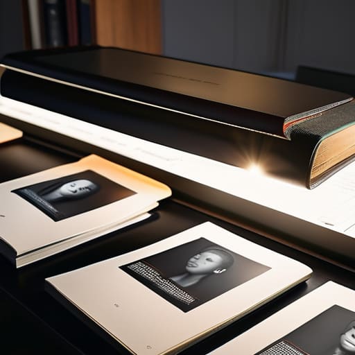
When the publisher calls and says they need the file by five, but your subject is currently stuck in traffic and losing their cool, you have to stop thinking like an artist and start thinking like a fixer. The chaos isn’t just the schedule; it’s the realization that you’re shooting for a tiny rectangle on a spine, not a gallery wall. You need to nail the book jacket layout requirements before you even click the shutter. If you frame the shot too tightly because you’re caught up in the mood, the designer will end up cropping out the subject’s forehead, and suddenly, the portrait looks claustrophobic and cheap.
I always leave a ridiculous amount of “dead space” above the head and to the sides. It feels wrong—it feels like you’re wasting the frame—but you are essentially pre-designing the cover with your camera. You need to account for the title text and the author’s name. If you don’t respect the portrait aspect ratio for publishing from the start, you’ll spend the next three hours trying to fix a composition that was doomed the moment you set your tripod. Keep your eye on the negative space; it’s just as important as the eyes.
Chasing the Mood Nuanced Portrait Lighting for Authors
When you’re working on professional author branding, the temptation is to go for that “perfect” high-key, commercial look—everything bright, even, and utterly lifeless. Don’t do it. An author needs to look like they have something to say, and usually, that requires a bit of shadow. I tend to lean toward a single large modifier, like an 80cm octa, placed about 45 degrees to the side and slightly above eye level. It creates enough fall-off to give the face shape without making them look like they’re in a noir film. If the subject is writing something heavy or academic, I’ll pull the light further away to soften the contrast; if it’s a thriller, I might tighten the beam to let the shadows do the heavy lifting.
Keep in mind that portrait lighting for authors has to play nice with the eventual book cover design photography. You aren’t just lighting a face; you are lighting a future layout. If you wrap the light too tightly around the head, you leave no room for the designer to place the title or the blurb without the image looking cluttered. I always leave a bit of “negative space” in the direction of the shadow, ensuring the light doesn’t fight the typography later.
Designing for the Spine Portrait Aspect Ratio for Publishing
Most photographers make the mistake of shooting a tight, centered headshot and then act surprised when the designer sends it back with an email saying, “I can’t use this.” You aren’t just taking a picture of a person; you are providing a raw asset for a complex puzzle. When you’re thinking about book jacket layout requirements, you have to stop thinking in squares. If you crop too tightly around the shoulders, you leave the designer zero room to breathe. They need space for the title, the blurb, and that awkward strip of negative space that keeps the typography from suffocating the author’s face.
I always tell my assistants to shoot wider than feels comfortable. I want to see the top of the head and plenty of shoulder room, even if it feels like we’re wasting half the frame. This flexibility is the secret to successful book cover design photography. If you give them a vertical sliver of a face, they can’t move it left or right to balance against the spine. Shoot for the worst-case scenario—which is usually a designer trying to fit a massive serif font into a tiny corner.
Beyond the Image Professional Author Branding and Book Cover Design
Once you’ve actually captured the shot, the real work—the part that makes or breaks a career—starts with how that image lives in the wild. You aren’t just taking a photo; you are providing the raw material for professional author branding. I’ve seen brilliant portraits fail simply because the photographer didn’t ask the publisher about their specific book jacket layout requirements. If the designer needs a vertical strip of negative space on the left for the title, and you’ve framed the author’s head right in the center of a tight crop, you’ve just handed them a headache.
I always tell my clients to think about the “afterlife” of the image. A portrait that looks stunning as a high-res file might fall apart when shrunk down to a tiny thumbnail on an Amazon listing. This is where the marriage of book cover design photography and technical foresight becomes vital. Don’t just focus on the eyes; focus on the breathing room around them. If you give the designer enough “air” to play with, they can wrap the typography around the subject without suffocating them, making the final product look intentional rather than cluttered.
The Real-World Checklist: 5 Things I Actually Do Before I Click the Shutter
- Check the negative space before you even look at the subject. A book jacket isn’t a standalone portrait; it’s a piece of a larger puzzle. If you frame a tight, beautiful headshot but leave no room for the title or the author’s name, you haven’t taken a book jacket photo—you’ve taken a lovely photo that the designer will hate. I always aim for more “dead” space than feels comfortable.
- Manage the “hand problem” early. As soon as the subject sits down, I ask them, “What do you do with your hands when you’re nervous?” It sounds silly, but it breaks the ice and lets us plan. If they start fidgeting with their rings or tucking their hands into their armpits, we can decide right then if we’re going to use a prop, a chair arm, or just lean into a more relaxed, seated pose.
- Watch the light, but watch the shadows on the face more. For authors, you usually want a bit of character, which means a little shadow is fine, but don’t let a single harsh modifier create “raccoon eyes” that make them look tired or unapproachable. I prefer a large octa through a diffusion silk about four feet away; it’s soft enough to hide skin texture but directional enough to give the face some shape.
- Prepare for the “I hate my face” moment. There is a specific point in every session—usually about twenty minutes in—where the client looks in the monitor and decides they are unphotogenic. When that happens, stop talking about the technical settings. Move the light slightly, change the angle of their chin, or just tell them a quick, true story to get them out of their own head.
- Always shoot for the crop, not just the person. I tell my assistants to make sure we aren’t just getting the head and shoulders. We need enough of the torso and perhaps even a bit of the environment to give the designer options. A vertical crop is standard, but if you don’t give them enough “meat” on the edges of the frame, they’ll end up stretching the image, and that’s when everything starts looking amateur.
## The Real Work
“The publisher doesn’t care if you used a Leica or a Canon, and frankly, neither do I. They care that the author looks like they actually wrote the book instead of looking like they’re being interrogated by the police, and they care that there’s enough negative space around the head so the designer doesn’t have to crop off an ear to fit the title.”
Iwona Krawczyk
The Final Frame
At the end of the day, a successful book jacket portrait isn’t about having the most expensive softbox or a perfectly calibrated sensor. It’s about the messy logistics you managed to navigate: the way you accounted for the spine width, the way you calmed a frantic author who was convinced they looked “too old” in the harsh light, and how you kept your eye on the compositional headroom required for the publisher’s typography. You’ve handled the lighting, the aspect ratios, and the inevitable chaos of the room. If you’ve done those things, you haven’t just taken a photo; you’ve provided a functional tool for a designer to build a world around.
When you finally pack up your gear and head home—likely with a bit of dust on your shoes and a slight headache—try to remember why we do this. We aren’t just capturing a likeness; we are capturing the humanity behind the prose. The most important part of the session isn’t the technical perfection of the file, but the moment the subject finally relaxes their shoulders and looks at you with actual presence. Trust your eyes, trust your prep, and remember that the connection is the real work. Everything else is just physics.