
I was sitting in a dimly lit studio last Tuesday, staring at my monitor with a growing sense of dread, wondering exactly how to pick the keeper from ten similar frames when the subject has just spent the last twenty minutes telling me they “look terrible” in every single one. It wasn’t a technical glitch or a bad sensor; it was that specific, exhausting moment where the lighting is technically correct, the focus is tack-sharp, but the energy in the room has completely curdled. You find yourself scrolling through a sequence of nearly identical shots, hunting for a micro-expression or a slight shift in the shoulders that justifies the hour you just spent fighting a cramped corner and a client’s sudden loss of confidence.
I’m not going to give you a lecture on histogram analysis or some high-brow theory about “visual weight” that you can’t use when you’re running behind schedule. Instead, I want to talk about the unseen variables—the way a chin tilt or a momentary release of tension tells you which shot is actually human. This is about the practical, messy reality of sorting the gold from the junk when your eyes are tired and the clock is ticking.
Understanding How to Pick the Keeper From Ten Similar Frames
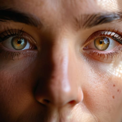
When you’re staring at a grid of ten nearly identical shots, your brain starts to play tricks on you. You think you’re looking for technical perfection, but usually, you’re just looking for the moment the subject stopped holding their breath. I’ve learned that identifying subtle differences isn’t about checking if the focus is tack-sharp on the iris—it’s about the micro-expressions. In one frame, the jaw is tight; in the next, there’s a slight softening of the eyes. That’s your keeper.
Don’t get bogged down in a complex comparative analysis techniques lecture. Instead, look for the “glitch.” I look for the stray hair that caught a rim light awkwardly or that split-second where the client’s shoulder slumped just enough to look natural rather than posed. My personal frame selection criteria usually boils down to one thing: which version of this person feels the most honest? If you spend twenty minutes evaluating image consistency across a burst, you’ll end up exhausted and indecisive. Pick the one that feels right in your gut, then move on to the next set.
Key Things to Know
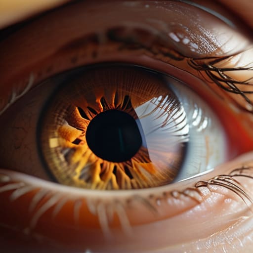
First, stop looking for the “perfect” shot; it doesn’t exist, especially when you’re working with a client who’s spent the last hour fighting their own reflection. Instead, focus on identifying subtle differences in the eyes. In a series of ten nearly identical frames, the difference between a winner and a discard is often just a fraction of a millimeter in the eyelid position or a micro-expression that makes the subject look human rather than startled. If the catchlight is dead in one and dancing in the other, that’s your winner.
You also need a personal set of frame selection criteria that goes beyond just “is it sharp?” I always look at the tension in the jaw and the position of the hands—because, as I always ask them, that’s where the nerves live. Even if the focus is technically perfect, if the subject looks like they’re holding their breath, the image is dead. You aren’t just performing a technical check; you are looking for the moment where the person actually showed up in the frame.
Practical Tips and Steps
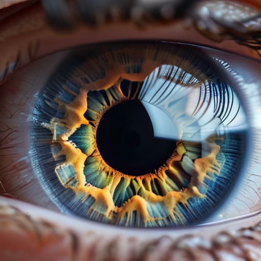
First, stop looking at the images as individual triumphs and start treating them as a single data set. When you’re stuck in that loop of clicking through nearly identical shots, you need a strict frame selection criteria to break the paralysis. I usually start by checking the eyes—if the catchlight is even a millimeter off or the focus has drifted just slightly toward the ear, the shot is dead to me. It sounds pedantic, but when you are identifying subtle differences in a high-pressure session, that tiny shift in focus is often the only thing separating a usable portrait from a wasted minute of client time.
Once you’ve cleared the technical junk, move to the micro-expressions. This is where the real work happens. I don’t look for the “perfect” smile; I look for the moment the tension leaves the jaw or the hands stop looking like they’re gripping a ledge. You aren’t just performing a visual quality assessment; you are looking for the moment the subject actually settled into the room. If one frame has a slightly softer shadow but the subject looks human, take it. The technical perfection of the other nine doesn’t matter if they look like they’re posing for a passport photo.
Common Mistakes to Avoid
The biggest trap is falling in love with the “vibe” of a shot while ignoring the technical fallout. I see assistants do this all the time—they find one frame where the subject looks soulful, but they ignore the fact that the catchlight is dead or a stray shadow is eating the jawline. When you’re evaluating image consistency, don’t let a momentary mood blind you to a fundamental failure in your lighting setup. If the eyes aren’t sharp, the soul doesn’t matter; you’re just left with a blurry, expensive mistake.
Another mistake is getting stuck in a loop of micro-analysis without a clear exit strategy. You start identifying subtle differences in skin texture or hair placement that no client will ever notice, wasting twenty minutes on a single sequence. This is how you lose the light and the momentum of the shoot. Set your criteria before you even look at the LCD: is it the expression, the eye contact, or the posture? Pick your winner and move on. Stop trying to find perfection in a room that was never set up for it.
Final Thoughts
At the end of the day, don’t let the fear of making a “wrong” choice paralyze you. We’ve all been there—staring at a screen until the eyes glaze over, trying to force a decision between shots that look identical to anyone else. But your job isn’t just about looking for technical perfection; it’s about identifying subtle differences in how the subject actually feels in that moment. Sometimes the keeper isn’t the one with the sharpest eye contact, but the one where the tension in their shoulders finally dropped for a split second.
Stop trying to apply a rigid mathematical formula to every single shutter click. Instead, trust your gut once you’ve run through your basic frame selection criteria. If you’ve checked the focus and the light, and you’re still stuck, walk away from the monitor. Get a coffee, look at something that isn’t a pixel, and come back. Usually, the one that jumps out at you when you aren’t trying to find it is the one that actually belongs in the final set.
Five ways to stop drowning in your own contact sheet
- Look for the micro-expression, not the pose. Usually, in a burst of ten shots, nine are “correct” but dead. The keeper is the one where the subject’s eyes actually hit the lens, or where that tension in their jaw has finally dropped for a fraction of a second.
- Check the hands. I always ask people what they do with their hands when they’re nervous, and usually, that nervous energy bleeds into the frame. If one shot has a hand that looks like a claw and the other has a hand that looks relaxed, you pick the relaxed one, even if the eyes are slightly less sharp.
- Watch the catchlights. If you’re working with a single light source—which is how I prefer to work—you’ll notice that in a sequence, the subject’s head moves just enough to shift the reflection in their eyes. One frame will have a dull, flat eye; the keeper will have that tiny, sharp spark that makes them look alive.
- Ignore the “perfect” composition for a second and look at the light on the skin. Sometimes a slight tilt of the head moves a shadow right across the nose or under an eye, making the subject look tired or older than they are. If the lighting in frame four is slightly more forgiving on their complexion than frame seven, take the win and move on.
- Trust the gut, not the pixel-peeping. If you spend twenty minutes zooming in to 400% to find a microscopic bit of grain, you’ve already lost the battle. If you can’t tell which one is better at a normal viewing distance, they’re probably both equally mediocre—pick the one that feels least like a struggle.
The illusion of choice
You aren’t looking for the “best” photo among ten nearly identical shots; you’re looking for the one moment where the subject stopped performing and actually existed. Usually, that’s the frame where the light hit the eye just right, or where they finally stopped worrying about what they were doing with their hands.
Iwona Krawczyk
The Final Selection
At the end of the day, picking the keeper isn’t about finding the frame with the sharpest eyelashes or the most mathematically perfect light. It’s about recognizing that moment when the tension in the room finally broke and your subject stopped performing and started actually being there. You’ve looked at the technicalities—the catchlights, the posture, the way the modifier hit the cheekbone—and you’ve ruled out the mistakes. Now, you have to trust your gut. If you find yourself oscillating between three shots that all look technically flawless, stop looking at the pixels and start looking for the humanity in the eyes. That’s usually where the winner is hiding.
Don’t let the fear of “what if” drive your selection process. We’ve all been there, staring at a screen at 11 PM, wondering if we should have gone with the slightly more candid shot instead of the composed one. But remember: a perfect technical image that feels sterile is a failure, while a slightly imperfect frame that captures a soul is a masterpiece. The camera didn’t make the choice, and neither should a checklist. Trust the years of assisting, trust the intuition you’ve built in the trenches, and just pick the one that makes you feel something. The rest is just math.